| Customizing the Development Environment |
|
|
Customizing the Development Environment |
|
| Customizing the Development Environment |
|
|
Customizing the Development Environment |
|
This section contains the complete syntax, with examples, for VTML containers and controls.
The following table describes the TabDialog container.
| <CONTAINER TYPE="TabDialog" .../> | |
|---|---|
| TabDialog control is a special container control, because it can only contain <CONTAINER TYPE="TabPage"> tags. This is natural because one needs to specify the tab pages before embedding more controls on the tab dialog box itself. | |
| NAME | The name of the TabDialog becomes the name of the variable to query to find out which TabPage was chosen. |
| MULTILINE | If specified, tabs can occupy multiple rows, otherwise if there are more tabs than fit on one row, a scroll control appears. |
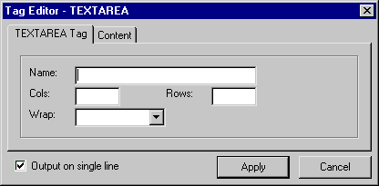
<CONTAINER NAME="MainTabDialog" TYPE="TabDialog" WIDTH=MAXIMUM

    HEIGHT=MAXIMUM>


    <CONTAINER  NAME="TabPage1" TYPE="TabPage" CAPTION="TEXTAREA
Tag">


        ... embedded controls


    </CONTAINER>


    <CONTAINER  NAME="TabPage2" TYPE="TabPage"
CAPTION="Content">


        ... embedded controls


    </CONTAINER>


</CONTAINER>
The following table describes the Tab Page container:
| <CONTAINER TYPE="TabPage" .../> | |
|---|---|
| TabPage control is also special because it can only be contained inside a TabDialog CONTAINER control. | |
| NAME | In the ATTRIBUTES section of a Tag Definition, a TabDialog can be bound as a CONTROL to an attribute named TYPE. The value of the variable corresponding to this control will be the name of the selected TabPage. This variable can then be queried in WIZML to find out which TabPage was selected when the dialog was accepted by the user. |
| CAPTION | Caption displayed on the top of the tab. |
<CONTAINER NAME="MainTabDialog" TYPE="TabDialog" WIDTH=MAXIMUM

    HEIGHT=MAXIMUM>


    <CONTAINER  NAME="TabPage1" TYPE="TabPage" CAPTION="TEXTAREA
Tag">


        ... embedded controls


    </CONTAINER>


    <CONTAINER  NAME="TabPage2" TYPE="TabPage"
CAPTION="Content">


        ... embedded controls


    </CONTAINER>


</CONTAINER>
The following table describes the Panel container.
| <CONTAINER TYPE="Panel" .../> | |
|---|---|
| Panel is the most common container control. Panel can contain any control or container except TabPage, which is restricted to TabDialog. | |
| CAPTION | Caption displayed in the upper left corner of the panel boundary. |
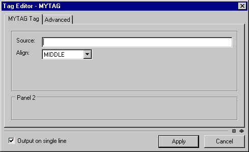
<EDITORLAYOUT HEIGHT=225>
<CONTAINER NAME="MainTabDialog" TYPE="TabDialog" WIDTH=MAXIMUM
HEIGHT=MAXIMUM>
<CONTAINER NAME="TabPage1" TYPE="TabPage" CAPTION="MYTAG
Tag">
<CONTAINER NAME="Panel1" TYPE="Panel" DOWN=5 RIGHT=10
WIDTH="MAXIMUM" HEIGHT=125>
<CONTROL NAME="lblSource" TYPE="Label" CAPTION="Source:"
DOWN=17 RIGHT=10 WIDTH=50/>
<CONTROL NAME="txtSource" TYPE="TextBox" ANCHOR="lblSource"
CORNER="NE" WIDTH="MAXIMUM"/>
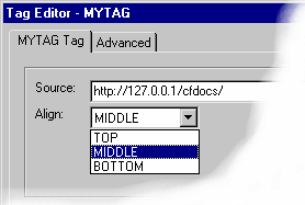
<CONTROL NAME="lblAlign" TYPE="Label" CAPTION="Align:"
ANCHOR="lblSource" CORNER="SW" DOWN=11 WIDTH=50/>
<CONTROL NAME="dropAlign">TYPE="DropDown" ANCHOR="lblAlign"
CORNER="NE" WIDTH=100>
<ITEM VALUE="TOP" CAPTION="TOP" />
<ITEM VALUE="MIDDLE" CAPTION="MIDDLE" SELECTED/>
<ITEM VALUE="BOTTOM" CAPTION="BOTTOM" />
</CONTROL>
</CONTAINER>
<CONTAINER NAME="Panel2" TYPE="Panel" CAPTION=" Panel 2 "
ANCHOR="Panel1" CORNER="SW" DOWN=5 WIDTH="MAXIMUM"
HEIGHT=MAXIMUM
</CONTAINER>
</CONTAINER>
<CONTAINER NAME="Advanced" TYPE="TabPage"
CAPTION="Advanced">
</CONTAINER>
</CONTAINER>
</EDITORLAYOUT>
The following table describes the Label control:
| <CONTROL TYPE="Label" .../> | |
|---|---|
| A label can serve as a caption for an input control and can display extra information about the dialog. This is an output-only control. | |
| CAPTION | The text displayed by the label. |
| AUTOSIZE | YES/NO. Automatically sizes the control to the text it contains. This option is overridden if WIDTH or HEIGHT are explicitly specified. |
| TRANSPARENT | YES/NO. Makes label transparent. |
| ALIGN | LEFT/CENTER/RIGHT. Specifies the horizontal alignment of text in the label. |
| VALIGN | TOP/CENTER/BOTTOM. Specifies the vertical alignment of text in the label. |
<CONTROL NAME="lblSource" TYPE="Label" CAPTION="Source:" DOWN=17 RIGHT=10
WIDTH=50/>
The following table describes the Text Box control.
| <CONTROL TYPE="TextBox" .../> | |
|---|---|
| A simple textbox control. | |
| VALUE | The text displayed by the text box. |
| AUTOSIZE | YES/NO. Automatically sizes the control to the text it contains. This option is overridden if WIDTH or HEIGHT are explicitly specified. |
| EDITABLE | YES/NO. Enables or disables editing. |
| AUTOSELECT | YES/NO. Decides whether contents get highlighted when the cursor enters the text box. |
| MAXLENGTH | Limits the amount of text in the text box to a specific number of characters. |
| PASSWORDCHAR | A character to be used to mask entered text. You can create a simple password box using PASSWORDCHAR="*". |
| ALLOWDECIMALPOINT | YES/NO. Indicates whether an entered number can contain a decimal point. |
| ALLOWNEGATIVE | YES/NO. Indicates whether an entered number can be negative. |
| CHARCASE | NORMAL/UPPER\LOWER. Specifies whether entered text is automatically uppercase or lowercase. The default is NORMAL, preserving the entered case. |
| VALIGN | TOP/CENTER/BOTTOM. Vertical alignment of text in the label. |
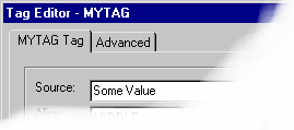
<CONTROL NAME="lblSource" TYPE="Label" CAPTION="Source:" DOWN=17 RIGHT=10

    WIDTH=50/>

<CONTROL NAME="txtSource" TYPE="TextBox" VALUE="Some Value"

    ANCHOR="lblSource" CORNER="NE" WIDTH="MAXIMUM"/>
The following table describes the DropDown control.
| <CONTROL TYPE="DropDown" .../> | |
|---|---|
A drop-down list box. This tag requires <ITEM> subtags, which specify the list of items in the drop-down list. The item tag has CAPTION and VALUE attributes. CAPTION specifies the visible item text while VALUE specifies the underlying value for the option. SELECTED attribute specifies which item is initially selected. When free-text is entered into an EDITABLE DropDown, the actual text is considered to be the value of the control.
Example:
<CONTROL NAME="dropTagOptions" TYPE="DropDown" WIDTH="200"> | |
| EDITABLE | The EDITABLE attribute specifies either editable combo-box or drop-down list behavior. |
<CONTROL NAME="lblAlign"

    TYPE="Label" CAPTION="Align:"

    ANCHOR="lblSource" CORNER="SW" DOWN=11 WIDTH=50/>


<CONTROL NAME="dropAlign"

    TYPE="DropDown" ANCHOR="lblAlign" CORNER="NE" WIDTH=100>

    <ITEM VALUE="TOP"    CAPTION="TOP" />

    <ITEM VALUE="MIDDLE" CAPTION="MIDDLE" SELECTED/>

    <ITEM VALUE="BOTTOM" CAPTION="BOTTOM" />

</CONTROL>
The following table describes the ListBox control:
| <CONTROLTYPE="ListBox" .../> | |
|---|---|
| MULTISELECT | The MULTISELECT attribute decides whether the user can select multiple items. When multiple selections are made the control returns the values as a comma-delimited string. |
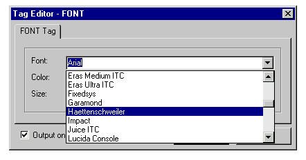
The following table describes the FontPicker control:
| <CONTROL TYPE="FontPicker" .../> | |
|---|---|
| A drop-down list of all fonts on the user's machine. Behaves like a combo-box. | |
| EDITABLE | Obsolete. A font name can be entered in the list box. |
<CONTROL NAME="lblFace" TYPE="Label" CAPTION="Font:" DOWN=17 RIGHT=10

    WIDTH=50/>

<CONTROL NAME="fontFace" TYPE="FontPicker" ANCHOR="lblFace"
CORNER="NE"

    WIDTH="MAXIMUM"/>
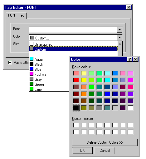
The following table describes the ColorPicker control:
| <CONTROL TYPE="ColorPicker" .../> |
|---|
| A simple drop-down color picker. Enables selection of a predefined color or special color code. Control returns value as a color name or hexadecimal value based on user's preferences. |
<CONTROL NAME="lblColor" TYPE="Label" CAPTION="Color:" ANCHOR="lblFace"

    CORNER="SW" DOWN=11  WIDTH=50/>


<CONTROL NAME="colorColor" TYPE="ColorPicker"
ANCHOR="lblColor"

    CORNER="NE" WIDTH="MAXIMUM"/>
<CONTROL NAME="lblColor" TYPE="Label" CAPTION="Color:" ANCHOR="lblFace"

    CORNER="SW" DOWN=11  WIDTH=50/>


<CONTROL NAME="colorColor" TYPE="ColorPicker"
ANCHOR="lblColor"

    CORNER="NE" WIDTH="MAXIMUM"/>
The following table describes the CheckBox control:
| <CONTROL TYPE="CheckBox" .../> | |
|---|---|
| A simple check box control. Returns `true' or `false'. | |
| CAPTION | Caption displayed next to the check box. |
| CHECKED | YES/NO. Specifies initial status. |
<CONTROL NAME="checkNoShading"TYPE="CheckBox" CAPTION=" No Shading"

    ANCHOR="numWidth" CORNER="NE" DOWN=4 RIGHT=20 WIDTH=MAXIMUM/
>
The following table describes the RadioGroup control:
| <CONTROL TYPE="RadioGroup" .../> |
|---|
A set of radio buttons. This tag requires <ITEM> sub-tags that specify the list of radio buttons. The item tag has CAPTION and VALUE attributes. CAPTION specifies the caption of the radio button, VALUE specifies the underlying value for the option. The SELECTED attribute specifies which radio options should be pre-selected.
Example:
<CONTROL NAME="radioTagOptions" TYPE="RadioGroup" WIDTH="200"> |
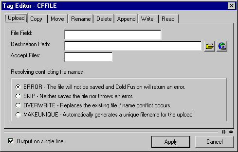
<CONTROL NAME="radioNameConflict"

    TYPE="RadioGroup" CAPTION="Radio One"

    ANCHOR="lblAccept" CORNER="SW" DOWN=35

    HEIGHT=MAXIMUM WIDTH=MAXIMUM


    <ITEM VALUE="ERROR" CAPTION="ERROR - The file

    will not be saved and ColdFusion will return

    an error." SELECTED="TRUE"/>


    <ITEM VALUE="SKIP" CAPTION="SKIP - Neither

    saves the file nor throws an error."/>


    <ITEM VALUE="OVERWRITE"  CAPTION="OVERWRITE -

    Replaces the existing file if name conflict occurs." />


    <ITEM VALUE="MAKEUNIQUE" CAPTION="MAKEUNIQUE - Automatically

        generates a unique filename for the upload." />


</CONTROL>
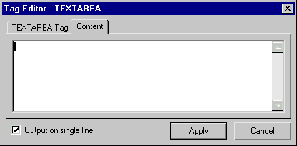
The following table describes the Text Area control:
| <CONTROL TYPE="TextArea" .../> | |
|---|---|
| A simple multiline text entry control. | |
| SCROLLBAR | NONE/HORIZONTAL/VERTICAL/BOTH. Specifies which scrollbars should be displayed. |
| WRAP | YES/NO. Enables wrapping of text. |
| INLINESTYLE | YES/NO. Controls the way the Style Editor edits the contents of the text area. YES (default) edits the contents as an inline style, NO treats the contents as a style sheet with multiple selectors. |
<CONTROL NAME="txtContent" TYPE="TextArea"

    DOWN=5 RIGHT=5

    WIDTH=MAXIMUM HEIGHT=MAXIMUM

    MAXWIDTHPADDING=5 MAXHEIGHTPADDING=5/>
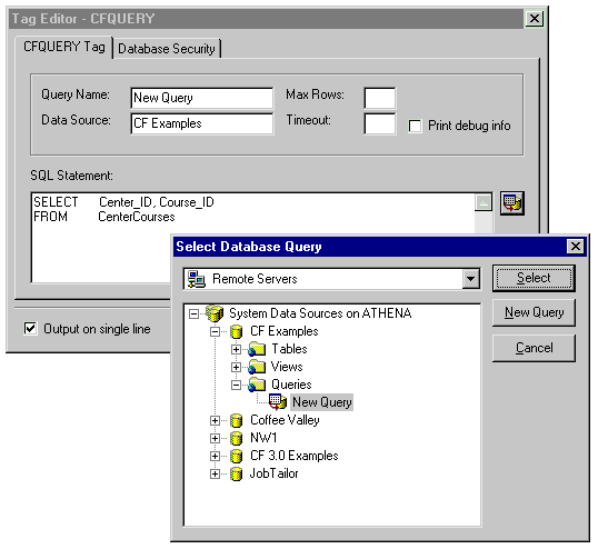
The following table describes the SQLTextArea control:
| <CONTROL TYPE="SQLTextArea" .../> (ColdFusion Studio and JRun Studio) | |
|---|---|
| A multi-line text entry control that allows the user to execute an SQL statement. The control contains a button that the user can use to invoke the query builder. | |
| SCROLLBAR | NONE/HORIZONTAL/VERTICAL/BOTH. Specifies which scrollbars should be displayed. |
| DSNAMECONTROL | The name of the control that should be populated with the Data Source name when a query is selected. |
| QUERYNAMECONTROL | The name of the control that should be populated with the Query Name when a query is selected. |
| WRAP | YES/NO. Enables wrapping of text. |
<CONTAINER  NAME="TabPage1" TYPE="TabPage" CAPTION="CFQUERY Tag">


    <CONTAINER  NAME="Panel1" TYPE="Panel" DOWN=5 RIGHT=10

        WIDTH="MAXIMUM" HEIGHT=80>


        <CONTROL NAME="lblQueryName"

            TYPE="Label" CAPTION="Query Name:"

            DOWN=17 RIGHT=10 WIDTH=80/>

        <CONTROL NAME="lblDataSource"

            TYPE="Label" CAPTION="Data Source:"

            ANCHOR="lblQueryName" CORNER="SW"

        DOWN=10 RIGHT=0 WIDTH=80/>

        <CONTROL NAME="txtQueryName" TYPE="TextBox"
ANCHOR="lblQueryName"

            CORNER="NE"  WIDTH=130/>

        <CONTROL NAME="txtDataSource" TYPE="TextBox"

            ANCHOR="lblDataSource" CORNER="NE" WIDTH=130/>

        <CONTROL NAME="lblMaxRows" TYPE="Label" CAPTION="Max Rows:"

            ANCHOR="txtQueryName"  CORNER="NE" DOWN=0 RIGHT=10 WIDTH=70/
>

        <CONTROL NAME="lblTimeout" TYPE="Label" CAPTION="Timeout:"

            ANCHOR="txtDataSource" CORNER="NE" DOWN=0 RIGHT=10 WIDTH=70/
>

        <CONTROL NAME="numMaxRows" TYPE="TextBox"
ANCHOR="lblMaxRows"

            CORNER="NE" WIDTH=30/>

        <CONTROL NAME="numTimeout" TYPE="TextBox"
ANCHOR="lblTimeout"

            CORNER="NE" WIDTH=30/>

        <CONTROL NAME="checkDebug" TYPE="CheckBox" CAPTION="Print
debug

            info" ANCHOR="numTimeout" CORNER="NE" RIGHT=10 DOWN=4

            WIDTH=MAXIMUM/>


    </CONTAINER>


        <CONTROL NAME="lblSQLStatement" TYPE="Label" CAPTION="SQL

            Statement:" ANCHOR="Panel1" CORNER="SW"DOWN=10 RIGHT=0

            WIDTH=110/>

        <CONTROL NAME="txtSQLStatement" TYPE="SQLTextArea"

            ANCHOR="lblSQLStatement" CORNER="SW" DOWN="8" WIDTH=MAXIMUM

            HEIGHT=MAXIMUM DSNAMECONTROL="txtDataSource"

            QUERYNAMECONTROL="txtQueryName"/>


</CONTAINER>
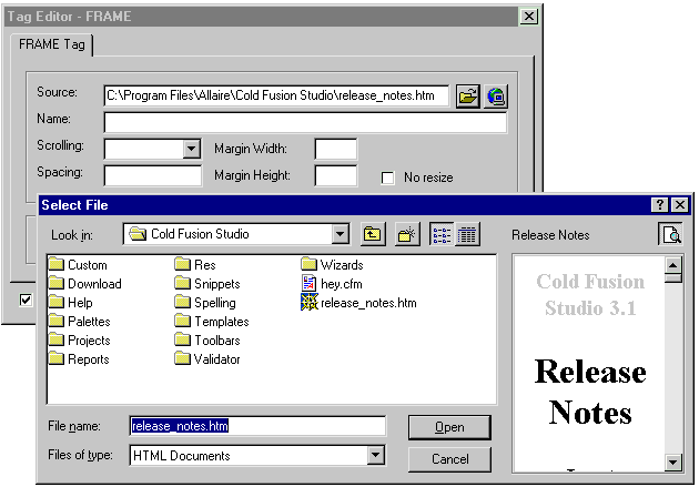
The following table describes the FileBrowser control:
| <CONTROL TYPE="FileBrowser" .../> | |
|---|---|
| A text box used to enter a file path. The control contains two toolbar buttons providing accessibility to local and remote file/directory browsing. | |
| FILTER | The file filter that should be used by the file/directory browsing dialog boxes. For example: FILTER="*.gif;*.jpeg;*.jpg". |
| DIRONLY | YES/NO. Specifies that a directory is being selected. This option will convert the file dialog boxes accessible from the browse buttons to become directory-browsing dialog boxes. By default, file-browsing is assumed. |
| FILENAMEONLY | YES/NO. Specifies that only a file name should be entered into the text box when a file is specified in a local or remote file dialog box. By default the entire path would be pasted. The attribute is irrelevant when the DIRONLY attribute is used. |
| RELATIVE | YES/NO. Instructs the control to calculate the relative path when a file or a directory path is selected. The relative path is calculated relative to the file currently opened. When a new file is being edited, it first has to be saved before a relative path can be calculated. By default, the absolute path is assumed. |
<CONTROL NAME="lblSource" TYPE="Label"

    CAPTION="Source:" DOWN=17 RIGHT=10

    WIDTH=60/>


<CONTROL NAME="txtSource" TYPE="FileBrowser"
ANCHOR="lblSource"

    CORNER="NE" WIDTH="MAXIMUM" RELATIVE

    FILTER="*.htm;*.html;*.cfml;*.cfm;*.asp" />
The following table describes the Image control:
| <CONTROL TYPE="Image" .../> | |
|---|---|
| An image control capable of containing BMP images. | |
| FILEPATH | Specifies the relative path of the image file from the editor template. |
| AUTOSIZE | YES/NO. Automatically sizes the control to the image it contains. This option is overridden if WIDTH or HEIGHT are explicitly specified. |
| TRANSPARENT | YES/NO. Controls transparency. |
| CENTER | YES/NO. Centers the image. |
<CONTROL NAME="imgApplet" TYPE="Image" FILEPATH="Images/Applet.bmp"

    DOWN=10 RIGHT=10 AUTOSIZE="Yes"/>
The following table describes the Image Map control:
| <CONTROL TYPE="ImageMapTextArea" .../> | |
|---|---|
| An image control capable of containing BMP images. | |
| SCROLLBAR | NONE/HORIZONTAL/VERTICAL/BOTH. Specifies which scrollbars should be displayed. |
| WRAP |
Enables wrapping of text. Disabled when a horizontal scrollbar is shown with SCROLLBAR="Horizontal" or SCROLLBAR="Both" even when the flag is present. |
| MAPNAMECONTROL | Required. The name of the control in the same editor that contains the NAME attribute of the MAP tag. |
The following table describes the StyleTextBox control:
| <CONTROL TYPE="StyleTextBox" .../> | |
|---|---|
| VALUE | The text displayed by the text box. |
| MAXLENGTH | Limits the amount of text in the style text box to a specific number of characters. |
The following table describes the Style Text Area control:
| <CONTROL TYPE="StyleTextArea" .../> | |
|---|---|
| SCROLLBAR | NONE/HORIZONTAL/VERTICAL/BOTH. Specifies which scrollbars should be displayed. |
| WRAP |
Enables wrapping of text. Disabled when a horizontal scrollbar is shown with SCROLLBAR="Horizontal" or SCROLLBAR="Both" even when the flag is present. |
| INLINESTYLE |
YES/NO. Controls whether the Style Editor button edits the contents of the text area as an "in-line style" or edits the contents as a full style sheet with multiple selectors. The default mode of the Style Editor when called from a Tag Editor is as an in-line style editor, so this attribute must be defined and set to "No" to allow editing of multiple style sheet rules. Since only a text area allows multiple lines (while a text box doesn't), this attribute is valid only for StyleTextArea but not for a StyleTextBox. |
The following table describes the ActiveX control:
| <CONTROL TYPE="ActiveX" .../> | |
|---|---|
A container for an embedded ActiveX control. For an ActiveX control to function properly within a tag editor the ActiveX control must implement four methods:
| |
| PROGID | The ProgID of the ActiveX control. |
<CONTROL NAME="activexGizmoPicker" TYPE="ActiveX"

    PROGID="company.Gizmo"/>
| Copyright © 2000, Allaire Corporation. All rights reserved. |
|